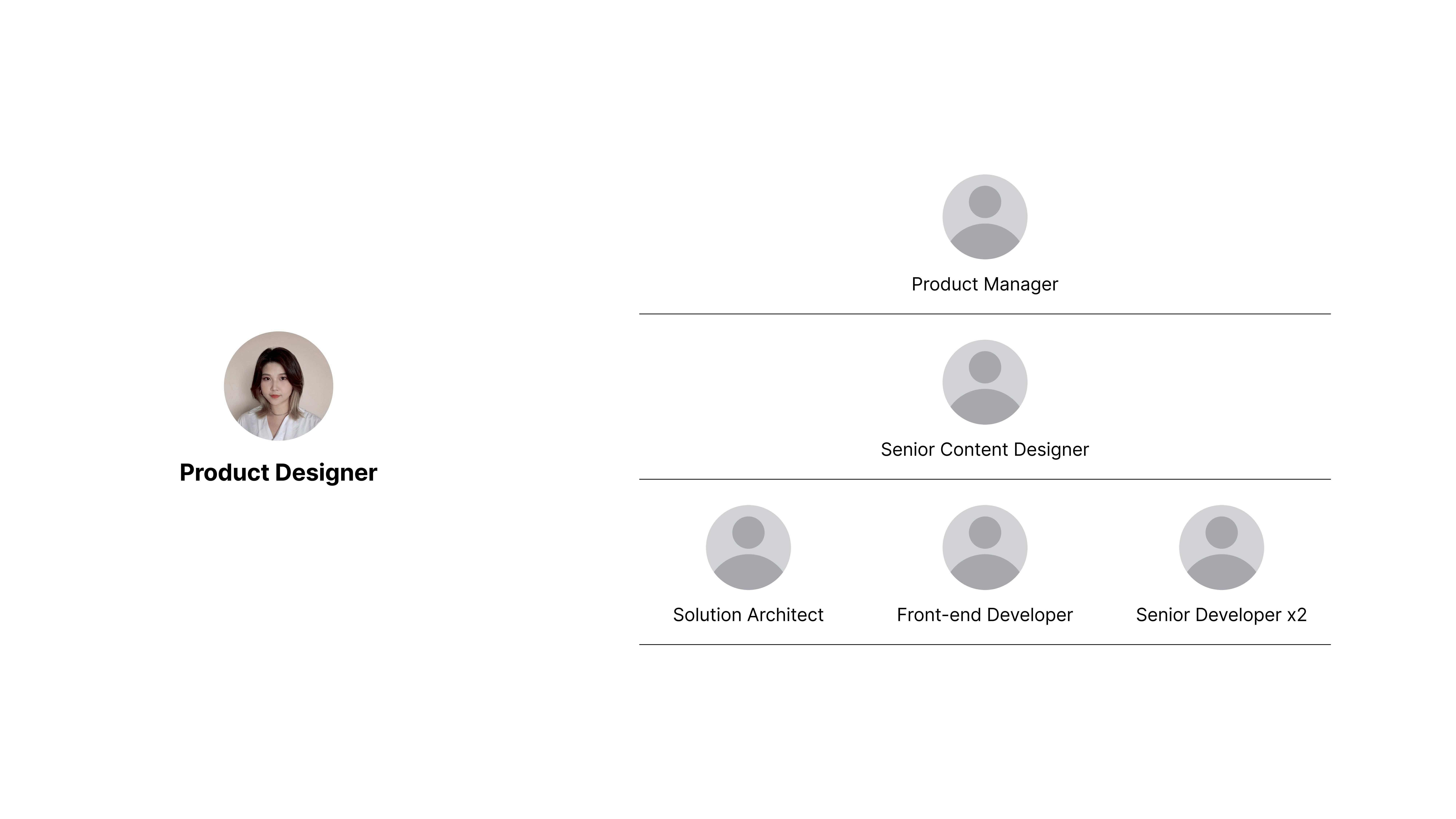
Royal Borough of Greenwich Design system

Royal Borough of Greenwich Design system

Royal Borough of Greenwich Design system

Role

My role in this project includes user research, workshop design and facilitation, content writing, service branding, UI/UX prototype design

Year

2022

Role

My role in this project includes Leading the Design System development, Accessibility design and testing, scaling and maintaining the system

Year

2024

The Royal Borough of Greenwich Design System provides reusable UI components and guidelines to ensure accessible, consistent, and user-friendly digital services. It is currently implemented in the Greenwich Council new official website and the Greenwich Community Directory.

OVERVIEW
OVERVIEW
OVERVIEW

The Royal Borough of Greenwich Design System is a comprehensive framework designed to ensure consistency, accessibility, and efficiency across the council’s digital services. It provides a set of reusable UI components, design principles, and best practices tailored for government services. The system is built to support user needs, enhance usability, and align with the borough’s branding and accessibility standards (WCAG). It includes guidance on typography, colors, spacing, and interactive elements, allowing developers and designers to create cohesive digital experiences.


You can explore the full documentation and components here:

Service

Design system

Accessibility Design

UI/UX Design

Duration

8 months

Industry

Public Sector

Service

Design system

UI/UX Design

Accessibility Design

Duration

8 months

Industry

Public Sector

My role
Objectives:
Objectives:
My role

Consistency: Establish a reusable component library for a unified design across council websites.


Accessibility: Ensure compliance with WCAG 2.1 AA standards to serve all residents, including those with disabilities.


Scalability: Build a flexible system that supports both government services and community platforms.


Efficiency: Reduce design and development time by enabling collaborative workflows between designers and developers.

Design Process:

1. Defining the Core Foundations


  • Established typography, color palette, spacing, grid system, and iconography.

  • Aligned with Royal Borough of Greenwich’s branding guidelines and content design principles.

2. Component Design & Documentation


  • Designed reusable UI components (buttons, forms, cards, tables, navigation, etc.) following atomic design principles.

  • Used Storybook for live documentation and version control to support developers.

3. Prototyping & User Testing


  • Created interactive prototypes in Figma for usability testing.

  • Gathered feedback from council staff, content designers, and accessibility testers to refine the components.

4. Developer Handoff & Implementation


  • Provided detailed design documentation to streamline the development process.

  • Worked closely with engineers to integrate the design system into the website’s CMS and front-end framework.

Challenges and Solution:

1. Aligning Stakeholders Across Teams


Challenge: Different teams had varied expectations and workflows.


Solution: Regular cross-functional workshops and usability testing ensured alignment and shared understanding.


2. Balancing Customization vs. Standardization


Challenge: Departments wanted custom UI elements, risking inconsistency.


Solution: Flexible design tokens allowed controlled customization while maintaining uniformity.


3. Ensuring Accessibility Compliance


Challenge: Meeting WCAG 2.1 AA standards across multiple council websites.


Solution: Automated audits and real-user testing ensured compliance in contrast, navigation, and screen reader support.


4. Developer Handoff & Implementation


Challenge: Miscommunication led to discrepancies in component implementation.


Solution: Storybook-based documentation and close collaboration refined component specifications.

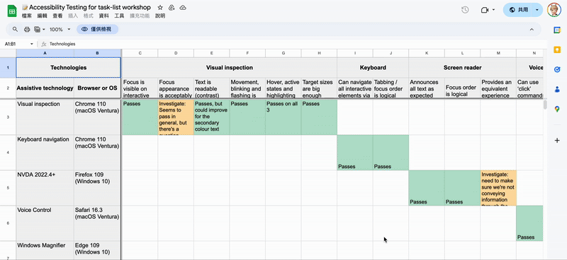
Accessibility testing:

WCAG 2.1 AA Compliance: Conducted contrast checks, font size validation, and ARIA implementation.


Screen Reader Testing: Used NVDA, VoiceOver, and JAWS to ensure proper accessibility.


Keyboard Navigation: Verified that all components are fully operable without a mouse.


Real User Testing: Conducted testing sessions with residents, including users with disabilities, to validate accessibility improvements.


Audit with Shaw Trust: Partnered with Shaw Trust to conduct an independent accessibility audit, ensuring compliance with best practices and real-world usability for users with disabilities.


I've created a Accessibility Manual Checklist to support our process

Outcome and impact

The design system is successfully implemented in two major council websites:


  • Increased efficiency for designers and developers, reducing redundancy and streamlining workflows.


  • Enhanced accessibility and usability across government services, ensuring a more inclusive experience for all users through constant monitoring with Google Analytics.

You can explore the full documentation and components here:

PORTFOLIO

CHECK OUT SOME MORE

Service Design

UI/UX Design

EV Sustainability

PORTFOLIO

CHECK OUT SOME MORE

Beyond Circularity | SPIRAL

Beyond Circularity | SPIRAL

Service Design

UI/UX Design

EV Sustainability

Beyond Circularity | SPIRAL

Beyond Circularity | SPIRAL

Service Design

UI/UX Design

EV Sustainability

PORTFOLIO

CHECK OUT SOME MORE

Beyond Circularity | SPIRAL

Beyond Circularity | SPIRAL

Beyond Circularity | SPIRAL

Beyond Circularity | SPIRAL

PORTFOLIO

CHECK OUT SOME MORE

Beyond Circularity | SPIRAL

Beyond Circularity | SPIRAL

Service Design

UI/UX Design

EV Sustainability

Beyond Circularity | SPIRAL

Beyond Circularity | SPIRAL

Service Design

UI/UX Design

EV Sustainability