OVERVIEW
The Taoyuan Volunteer Website, run by the Department of Social Welfare, connects volunteers with community organizations. However, complex navigation, a tedious registration process, and unclear UI made participation difficult. Our redesign streamlined the user journey, making it easier to sign up, navigate, and track participation. Through user research and iterative design, the new platform now fosters stronger engagement and a more efficient volunteer experience.
To deeply understand user needs, we conducted 106 surveys, 4 usability tests, and 12 competitive analyses of similar platforms. Insights revealed that many citizens were unaware of the website, and those who visited often struggled to find activities or complete registrations.


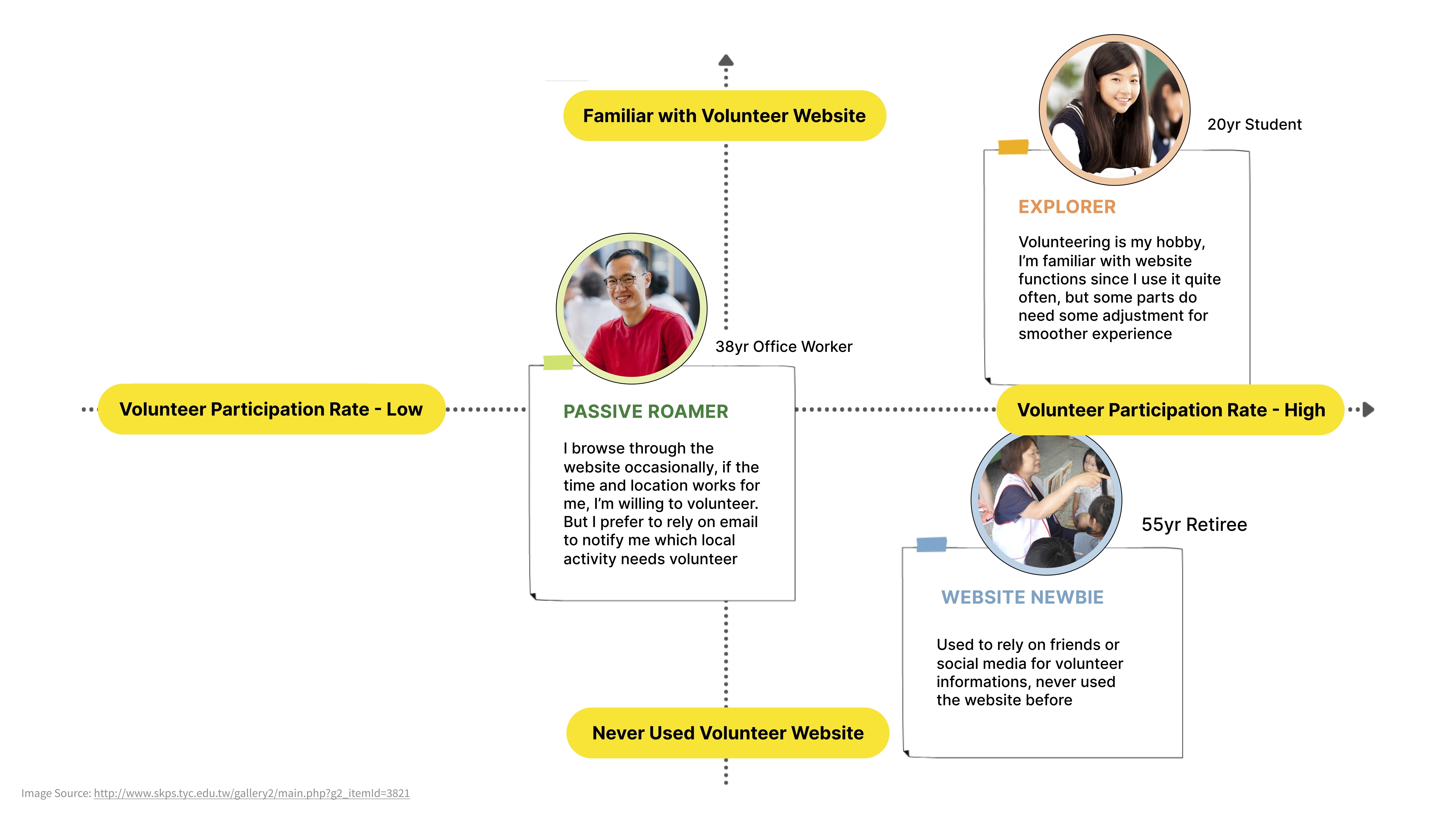
To create an effective and engaging volunteer platform, we first needed to understand our users. Through user interviews, surveys, and journey mapping, we identified three main user types:
Explorer (Active Volunteers) – Frequently use the platform but struggle with inefficient navigation.
Passive Roamer (Occasional Volunteers) – Interested but prefer direct notifications instead of searching manually.
Website Newbie (First-time Users) – Unfamiliar with the platform and find the interface confusing.
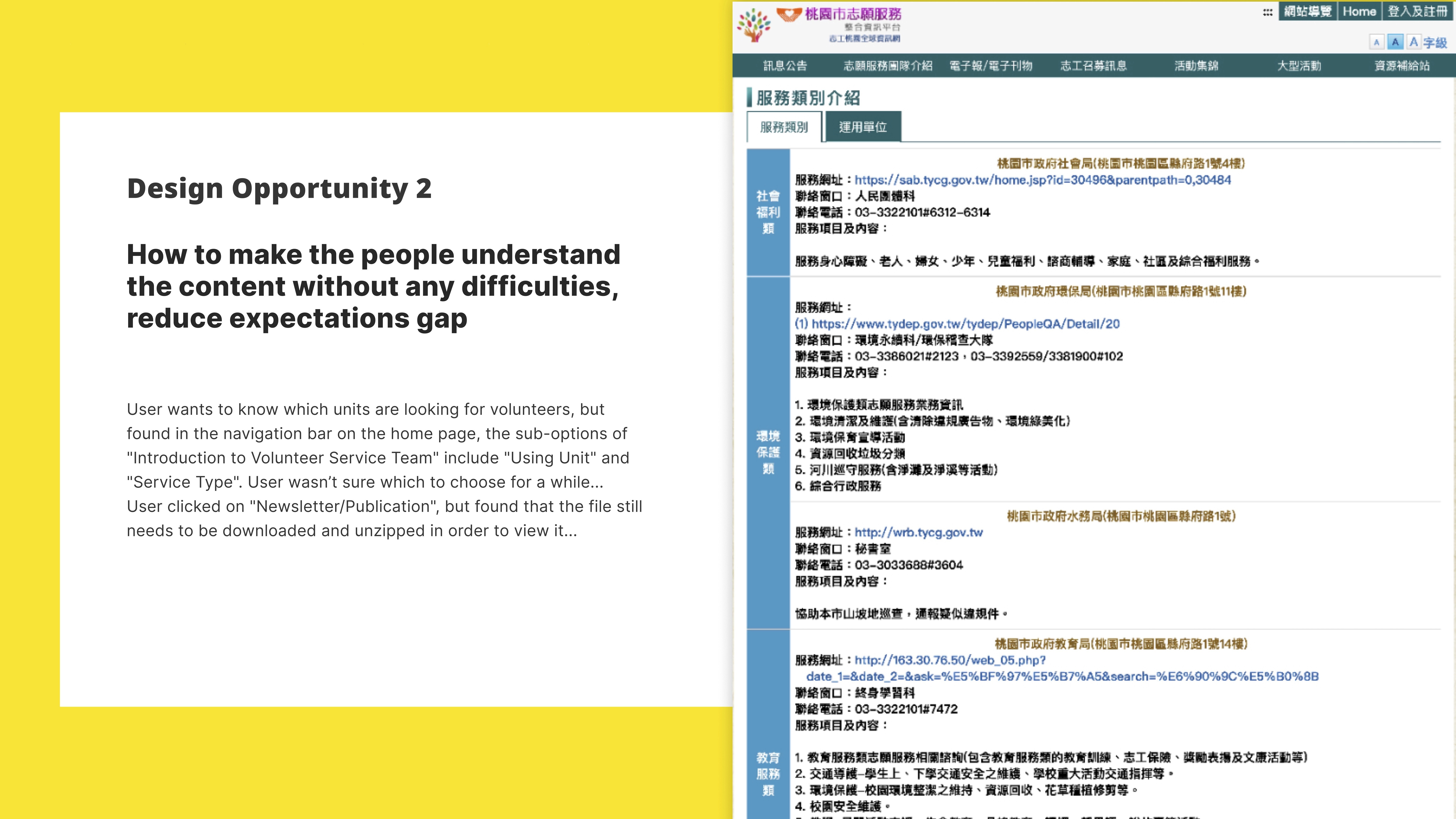
Their pain points included cluttered navigation, unclear UI language, and a complicated sign-up process. These insights guided our design decisions, ensuring a seamless experience for both experienced and new volunteers.

Through our research, we identified three major problems:
Cluttered navigation made it difficult to find relevant information.
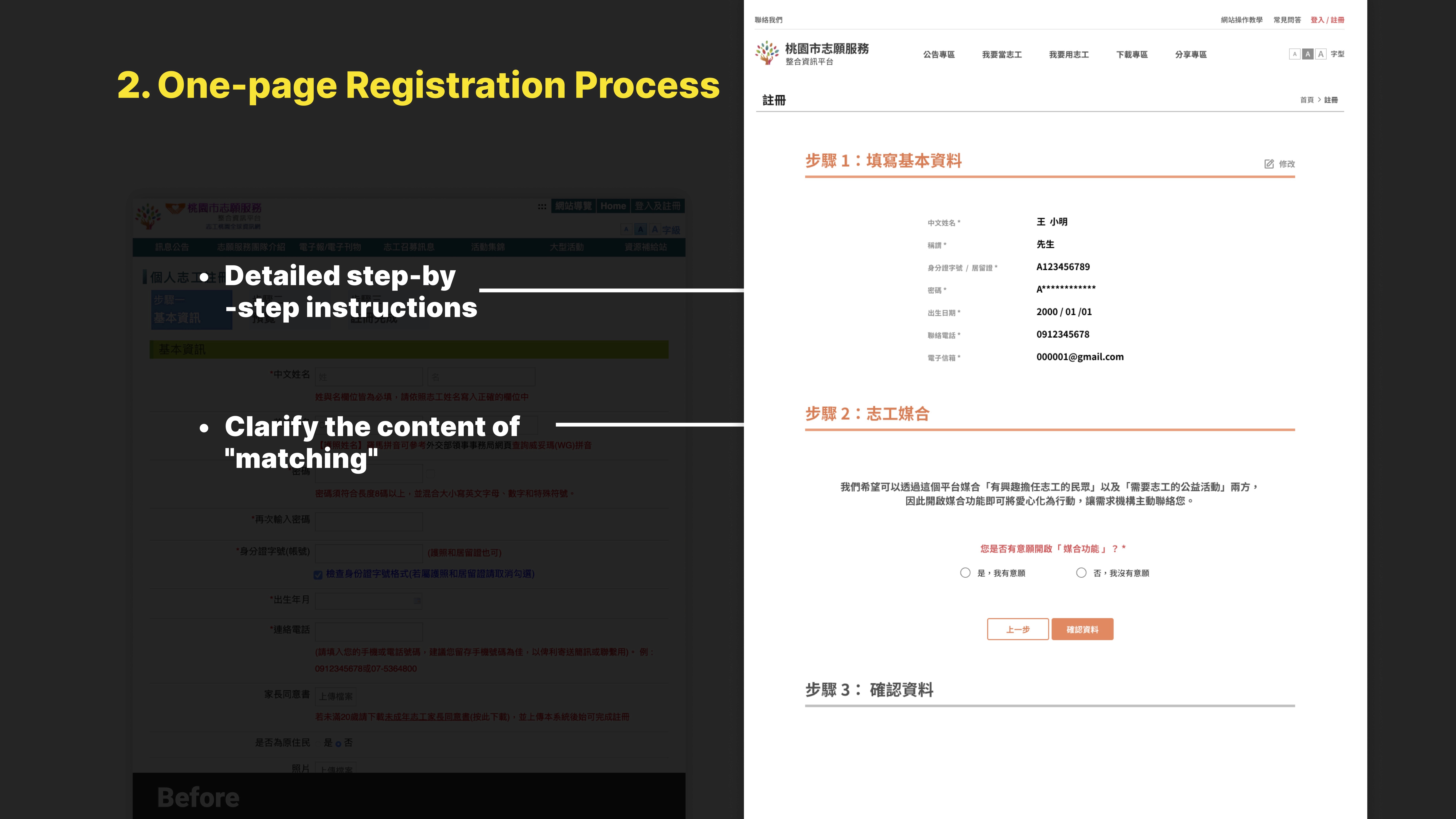
The volunteer registration process was lengthy and frustrating, often requiring users to call or use third-party forms.
UI language did not align with user expectations, causing confusion and frequent misclicks.
These challenges significantly impacted volunteer participation rates and reduced engagement from local organizations.
By identifying pain points, we were able to define key areas for improvement: clarity, efficiency, and accessibility.
Our strategy focused on simplifying navigation, improving registration, and aligning language with user expectations. We developed three primary user personas—a student, a working professional, and a retiree—each with unique needs and digital behaviors. The goal was to create a seamless experience for both first-time visitors and experienced volunteers while ensuring the Taoyuan Social Bureau could effectively track volunteer participation


Based on our findings, we implemented several key improvements:
✅ Reorganized homepage layout to make navigation intuitive.
✅ One-page registration process to allow seamless volunteer sign-ups.
✅ Clearer UI language to align with user expectations.
✅ Activity cards with filters (location, date, category) to enhance searchability.
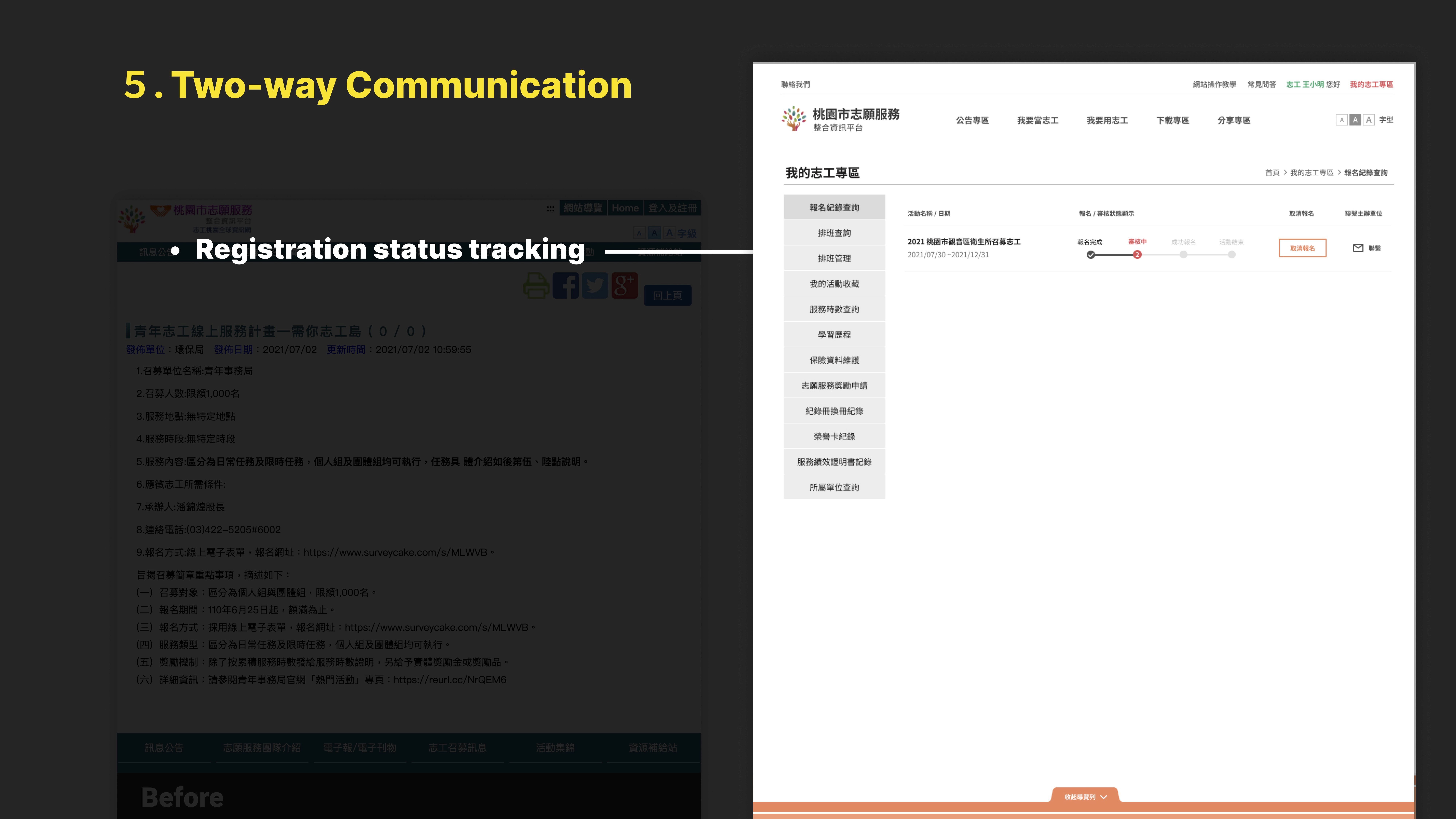
✅ Volunteer progress tracking system for improved transparency.
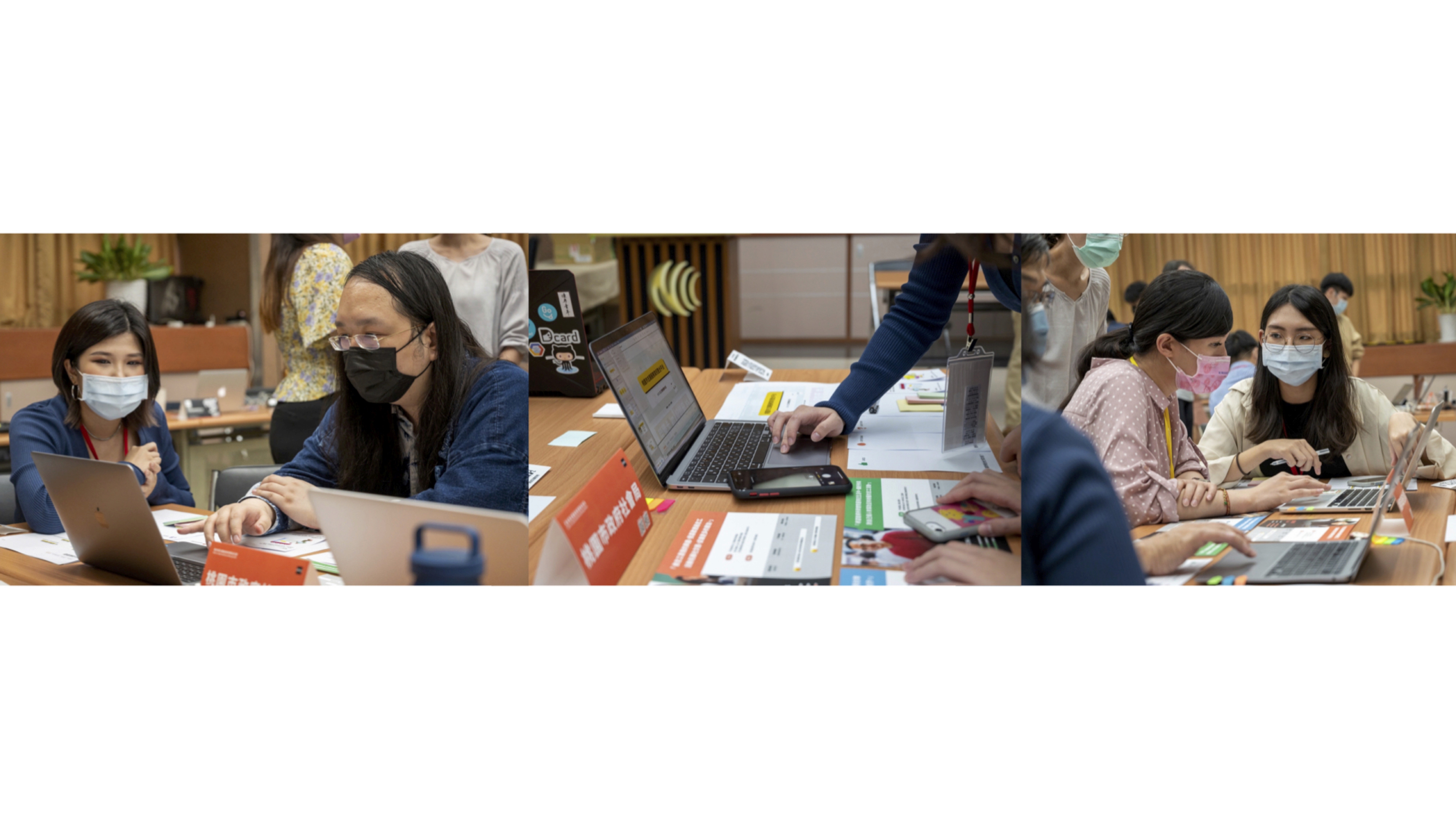
We started by brainstorming ideas by sketching out our wireframes